Which AI ad creatives
are worth a budget?
A model generates 60 mobile-game ad creatives in ten minutes for nothing. Deciding which of them deserves real ad spend is the part a studio actually pays for. I built four automatic quality filters, rated every image by eye without seeing the scores, and measured whether the filters agree with the human — then added a control that proved my best filter was measuring the wrong thing.
Try it
Pick a filter. The creatives re-rank instantly and the readout shows what I actually rated its top 10. Every number is measured.
2.23
ALL 60, UNFILTERED
All 60 creatives, unsorted. I rated every one of them 1–5 without seeing any of the scores. The average is 2.23 — the number any filter has to beat.
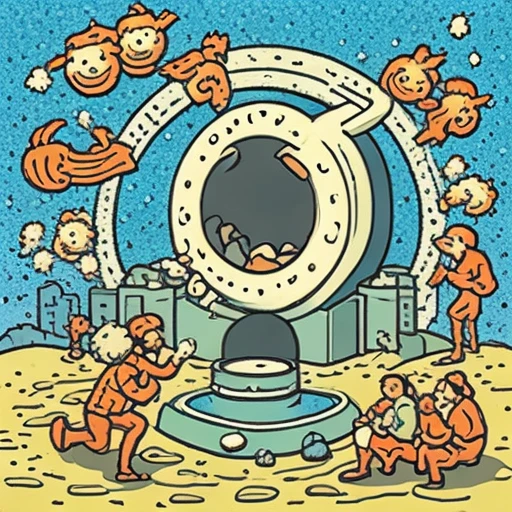
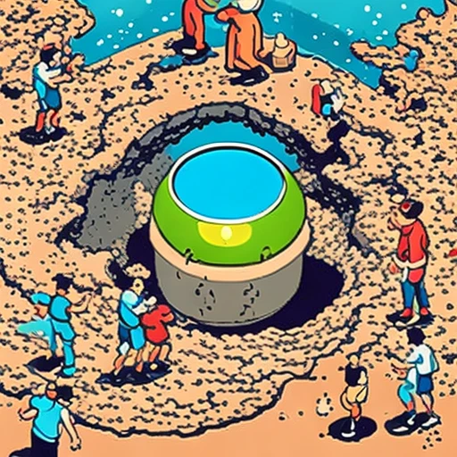


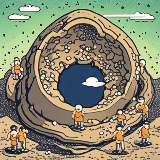

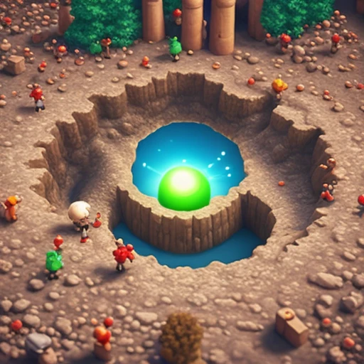













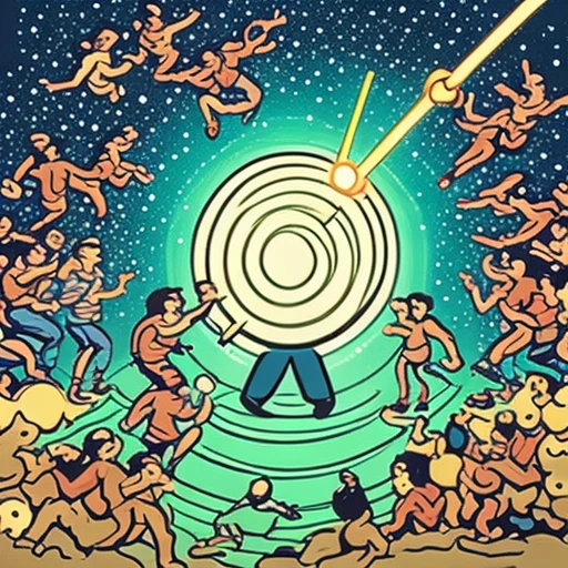

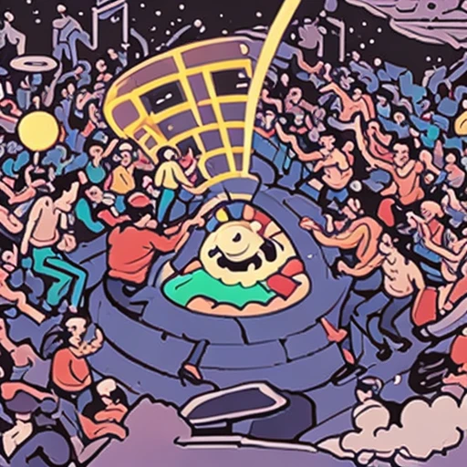
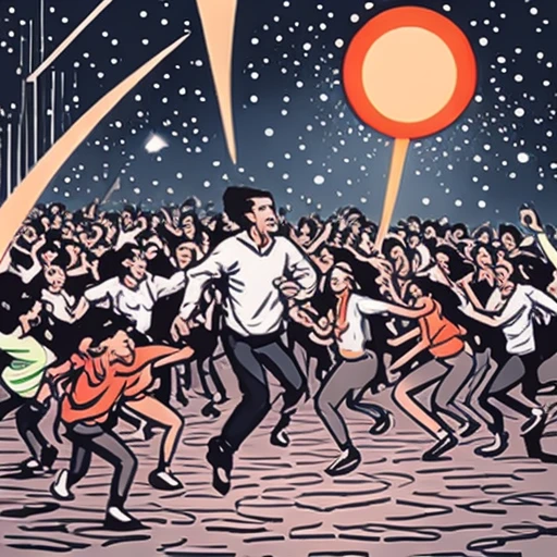
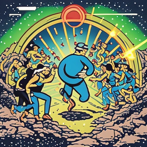


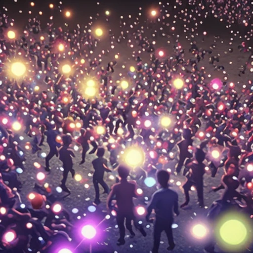


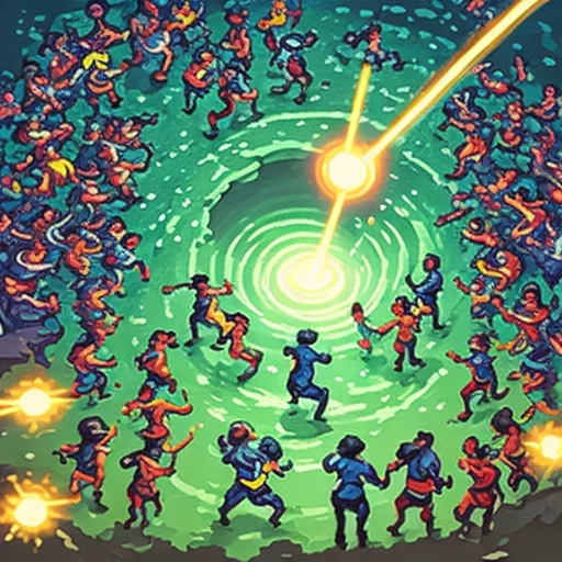
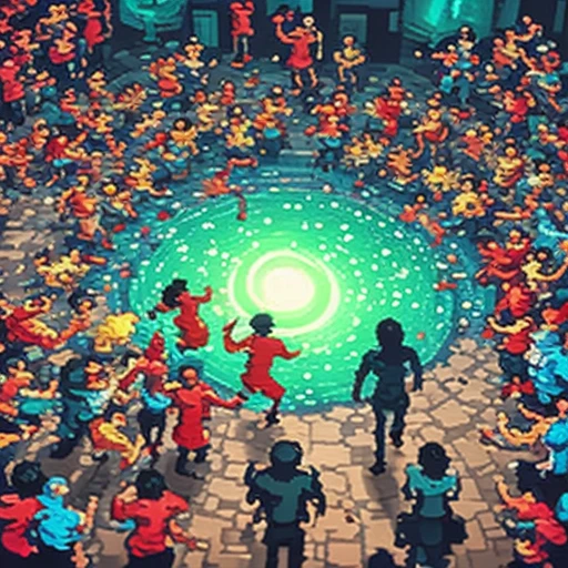
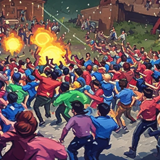
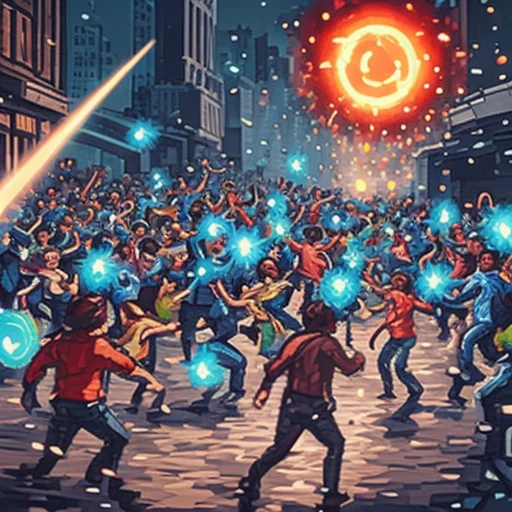

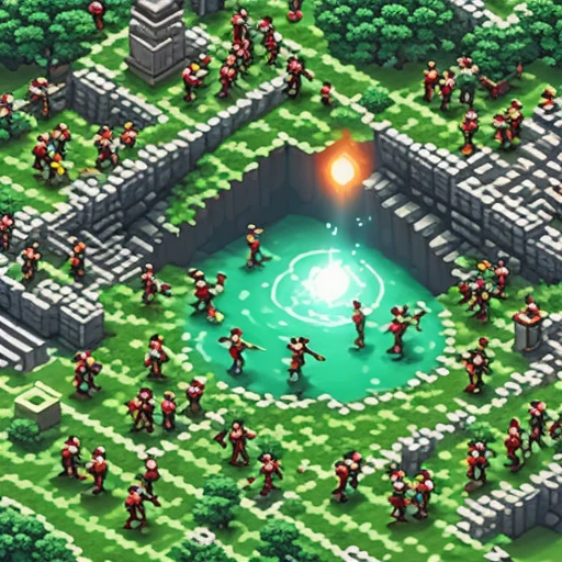
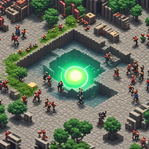

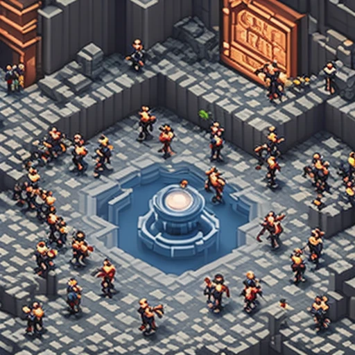




















NUMBER ON EACH THUMBNAIL IS MY RATING · HIGHLIGHTED ARE THE TOP 10
What each filter measures
Three are arithmetic over pixels. One is a small vision model. No language model judges anything — whether an image matches its prompt is measurable, and measuring beats asking.
Button-area clarity
How uncluttered the bottom-centre strip is. Mobile ads put the install button there, so a busy strip makes a creative unusable however good the rest looks. Five lines of arithmetic over pixels.
Prompt adherence
How closely the image matches the prompt that produced it, measured by CLIP — a 600 MB model trained on 400 million image-caption pairs. Catches an image that is attractive but off-brief.
Brand colour
Share of pixels close to the brand palette. Plain arithmetic, no model.
Distinctiveness
How far an image sits from every other image. Sixty renders from one brief are not sixty ideas — this asks how many are actually different.
Top-strip clarity (control)
The identical arithmetic as button-area clarity, run on the top strip — where there is no button and no story to justify it. It exists only to test whether the button-area metric measures what it claims.
What came out
| FILTER | RANK CORRELATION | TOP 10 RATING | VS NO FILTER |
|---|---|---|---|
| Button-area clarity | 0.59 | 2.70 | +0.47 |
| Prompt adherence | 0.21 | 2.60 | +0.37 |
| Brand colour | -0.05 | 2.00 | -0.23 |
| Distinctiveness | -0.35 | 1.70 | -0.53 |
| Top-strip clarity (control) | 0.69 | 3.30 | +1.07 |
Five lines of arithmetic beat a 600 MB model
Button-area clarity is a standard deviation over a rectangle of pixels. CLIP is a transformer trained on 400 million image-caption pairs. On this set the arithmetic predicted my judgement roughly three times better.
Filtering for distinctiveness actively hurts
The ten creatives furthest from every other creative averaged 1.70 against a baseline of 2.23. In a batch of generations, an outlier is usually a failure rather than an idea.
AND THEN THE CONTROL BEAT THEM BOTH
Button-area clarity came with a tidy rationale: mobile ads put the install button in the bottom centre, so a busy strip there makes a creative unusable. So I ran the identical arithmetic on the top strip, where there is no button and no story. It scored 0.69 against 0.59 — better on every measure. The filter was detecting a visually calm image all along. My rationale was written after the numbers arrived, and without a control it would have shipped as a finding.
What this does not prove
- One rater. This measures whether these filters track my judgement on this brief. A second rater would give an inter-rater agreement figure that this cannot.
- Sixty images is a small sample. At this size a correlation of 0.2 is hard to separate from nothing, so the ordering of the weak filters should not be over-read.
- The ratings are skewed — 26 of 60 scored 1. Much of what the good filters detect may be the difference between broken and coherent rather than good and better.
- The brand palette was never put in the prompt, so that filter measures whether the colours turned up by chance rather than whether the model followed an instruction.